A Controversial Rebrand
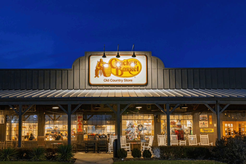
Cracker Barrel faced one of the toughest weeks in its history when it unveiled a new logo as part of a sweeping rebranding campaign. The change replaced the familiar rustic design — featuring a barrel and a man in overalls — with a modern shield and clean lettering. Instead of generating excitement, the redesign triggered widespread criticism. Loyal customers saw the update as an abandonment of the chain’s Americana identity, while online debates quickly transformed the decision into a culture war flashpoint.
The backlash intensified as critics accused the company of discarding a cherished aesthetic in favor of a sterile, corporate look. Social media platforms became flooded with messages calling for the return of the old design, while fans lamented the loss of a logo that had represented the brand since the late 1970s.
Financial and Political Pressure
The reaction had immediate financial consequences. Cracker Barrel’s stock price dropped notably in the days following the announcement, signaling that the controversy was affecting investor confidence. Pressure also mounted from outside the business world, as political figures weighed in on the matter. The calls for a return to tradition grew louder, and the company faced the risk of further alienating both customers and stakeholders.
Within days, the leadership recognized the growing discontent and reversed course, restoring the original logo and halting the rebranding campaign. The decision reflected not only the influence of public opinion but also the financial urgency to stabilize the company’s image in the markets.
A Broader Rebranding Effort
The logo change was part of a $700 million overhaul designed to revitalize the Tennessee-based chain. Under the guidance of new leadership, the initiative included redesigned dining rooms with fewer decorations, updated menu options, and promotional events featuring social media influencers. The goal was to modernize the chain’s appeal after years of declining foot traffic and lukewarm customer reviews.
However, the controversy revealed the risks of tampering with an identity deeply connected to nostalgia and tradition. Cracker Barrel has long marketed itself as a roadside refuge celebrating rustic Americana, and altering that core image struck many as a betrayal of its roots. The swift rejection of the new design highlighted how brand loyalty is shaped not just by food or service, but also by cultural symbolism.
Looking Ahead
By restoring its old logo, Cracker Barrel has opted for continuity over reinvention. The decision may reassure long-term patrons, but it also raises questions about how the company will tackle the broader challenges it set out to address: declining traffic, evolving customer expectations, and competition in the casual dining sector.
The episode underscores how brand perception can make or break corporate strategies. Modernization remains important, but for a company built on tradition, change must be balanced carefully with respect for heritage. Going forward, Cracker Barrel will need to find ways to innovate while staying true to the elements that made it a household name.


